Movie
Movie is the leading company in the cinema sector with 70% of the market in Uruguay. It has three business areas: the exhibition of films, the distribution of the same through labels, and the theaters. They are getting 60% of their sales through their website movie.com.uy

The Goal
In this user experiences analysis we want to achieve
A more transparent, reliable, easy and fast purchase process.
Reduce user errors in the purchase.
Use a better and constant communication language.
Create comprehensive flows.
Create a shopping focused website.
Create a responsive website.
The Problem
Understand why a lot of users started the purchase flow but didn't finish it.
Also, the client made the decision to refresh the visual design of the website.
My Role
Analyze each critical step in the purchase process.
Understand the users' needs to facilitate their experiences on the website.
Understand our scopes and technical difficulties to solve them in the best way.
Evaluate the results to make better decisions.
The Solution
Less opportunity for error, limiting decision-making in only one place in the purchasing process.
Fewer error messages, generating integral flows, removing interruptions.
A website focused on purchasing, focusing on the purchasing process.
Clearer website, showing the cost of the purchase throughout the process.
A more centralized website, showing each film only once with its different formats and schedules.
Activities Performed
My partner and I, as UX designers, performed the following activities: website usage analysis, heuristics evaluation, benchmarking, performing qualitative interviews, user interface design, wireframing, prototyping, and carrying out user tests.
User Interviews
To focus the research on the required objectives, we decided to interview the following two groups of users…
Archetype 1

Archetype 2
Personas
Based on the research found in the discovery period of the project, two personas were developed…

Seba
“I prefer to buy tickets online to avoid the queue”
Seba lives with his parents in the Buceo neighborhood, uses several apps during the day, mostly WhatsApp, YouTube, Uber Eats (onweekends), and uses a computer software in the laboratory where he works. Seba goes to the cinema 1 to 2 times a year. The reason to go to the cinema is that there is a very good film. He buys his tickets through the mobile website. He thinks the process is very good. He has credit card points (OCA card), but he never knows if he has enough points to get the tickets.
He would like to change the mandatory Sign In to get the tickets from the website because he often forgets his password. Also, he wants to change the place where the credit card promotion is chosen, because it is a very "Hidden" place.


Paula
“I always forget to choose the seats”
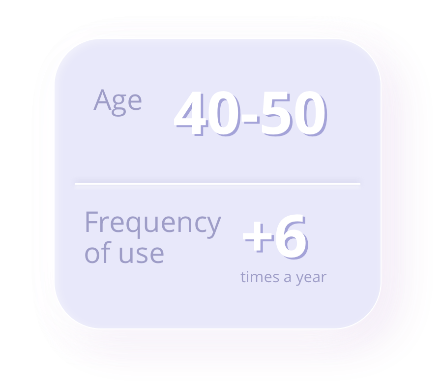
Paula Báez is 42 years old, lives with her husband (Alfredo, 48) and two daughters (Martina, 12 and Camila, 8) in Parque Miramar, Canelones. She likes to eat outside and go to the movies with her husband (on Fridays at night) or with her daughters (on Saturday afternoons). Paula uses various applications during the day. She Uses email, online banking and Microsoft Office, and also uses WhatsApp, Facebook, and Netflix.
When buying tickets, she does it through the desktop website, because it makes it easier for her to choose the seats. In the desktop version, she can see the complete seat map. The purchase process seems to her to be great, comfortable and very agile, although sometimes she is confused with the terminals in the same cinema. She uses the ITAU Bank rewards program.
She would change the place of the button to choose the seats and would also like to change the visual representation of the distance between the screen on the seat. She thinks it is not well represented on the seat map, but she does not know how to fix it.

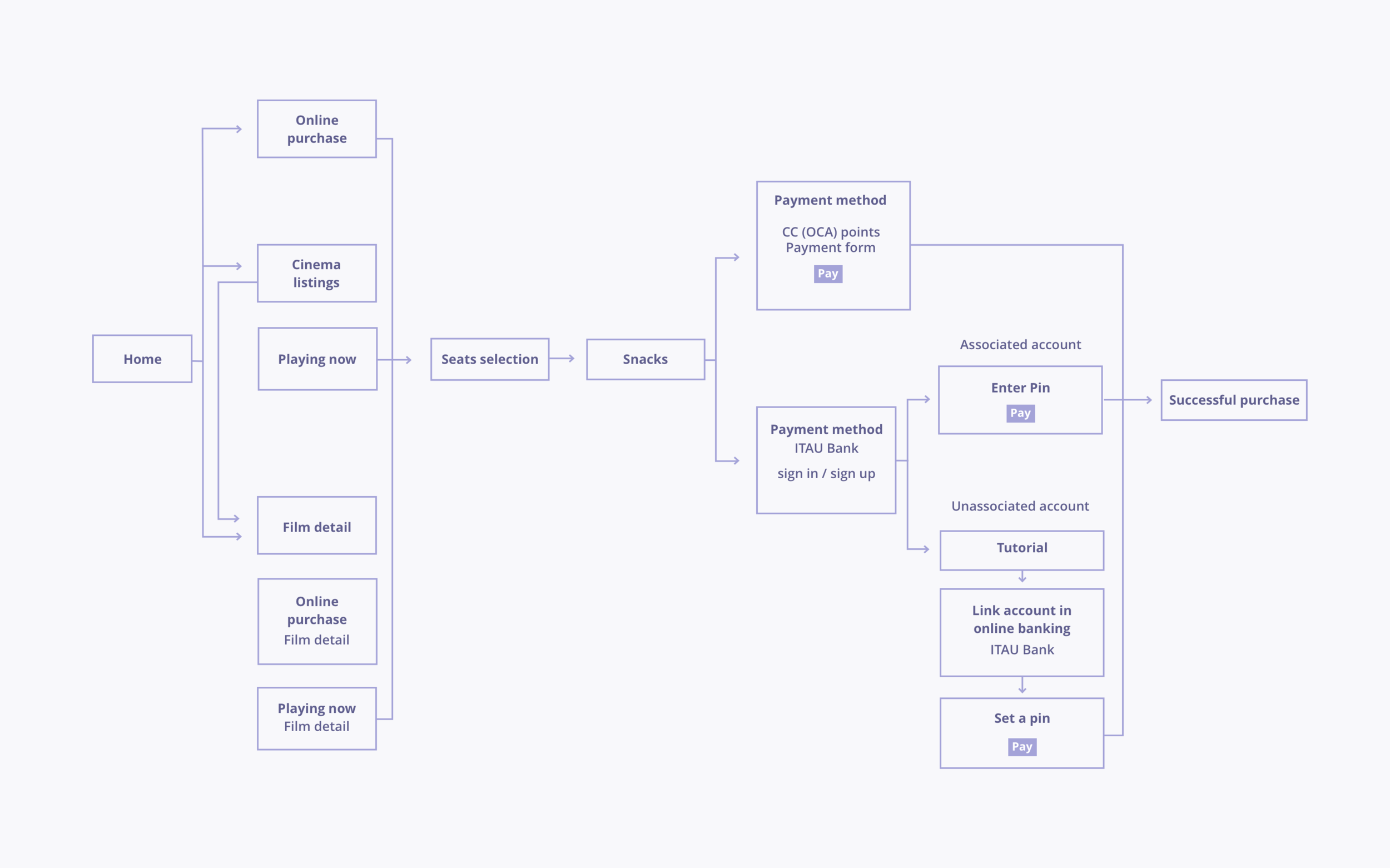
Purchase Flow
Thinking of the user’s needs, we created this purchase flow.
Wireframes
Based on the flow, we built each view needed by both desktop and mobile version.


Responsive User Interfaces design - Prototype creation
Once we validated the flow and wireframes with the client, I started working with the user Interfaces and I quickly jumped onto Axure to create an interactive prototype in order to test and validate purchase flow completely with the users.

User test result
The purchase flow was tested by 8 users in desktop version and 5 users in mobile version.
The user testing task was to buy 2 tickets for a movie, choosing the snack of preference.


